Teach close reading, onomatopoeias, and Pop art with Roy Lichtenstein’s Whaam!
Roy Lichtenstein’s Whaam! is part of the Tate collection. See their website for detailed information. Click on the painting for a high quality image that can be magnified.
The first time I saw Lichtenstein’s paintings I was puzzled by their being comics and was disinterested in their obsolescent composition; all the same I was interested in their unusual quality. Generally in that case you revise your ideas of the meaningless or disagreeable elements. There are good reasons for the comics and the composition.…The comics are a form of representation themselves and a fairly cursory and schematic one. Lichtenstein is representing this representation—which is very different from simply representing an object or a view. The main quality of the work comes from the contrast between the comic panel, apparently copied, and the art, nevertheless present. The enlarged, commercial scheme has an unusual space, color, and surface, and some other things. It does involve some novel ways of composing: the relationships of the areas as patterns of flat color, of two dark colors closely valued, and of differently colored and scaled Ben-Day dots; the shapes made by comic stylizations are odd, such as the concentric ones of an explosion or those of swirling water—waves and flames are similar—or lines of speed. The Ben-Day patterns and their various juxtapositions I like a lot.…Whaam!, Torpedo…LOS!, Conversation, In the Car, and I Don’t Care, I’d Rather Sink are all broad and powerful paintings.
—Donald Judd reviewing Roy Lichtenstein’s second show at the Castelli Gallery, in Arts Magazine (November, 1963)
If there is a general rule underlying the new iconography it is that there is no focus, no selectiveness about it. It would be erroneous to imagine them quite as dedicated to pictorial self-sufficiency, to sheer energy of form and composition. On the contrary, they depend too much on the repulsiveness of their imagery. The truth is the art galleries are being invaded by the pin-headed and contemptible style of gum chewers, bobby soxers, and worse, delinquents.
— Max Kozloff critiquing Pop art in his essay “’Pop’ Culture, Metaphysical Disgust, and the New Vulgarians,” in Art International magazine (1962)
Look at Whaam! Before reading the excerpt above, tell students the title of the piece and ask what is going on in this picture? Like early critics, students may quickly recognize the source of the work but be perplexed by its meaning. See how much they can decipher through a group discussion. Encourage students to identify the evidence that supports their reasoning. Students should likewise be encouraged to share wonderings and voice confusions. As the conversation slows, explain you are going to read two excerpts from early critical reviews. These are a little sophisticated and may require some unpacking. After reading these divergent reviews ask how does this new insight change your understanding of the painting?
Start with Art History
Roy Lichtenstein (1923–1997) was raised on the Upper West Side of New York City, where he attended public school and first began to dabble in the arts. His later art studies at Ohio State University were temporarily interrupted by World War II, when he was drafted into the army and trained as a pilot, a draftsman, and an artist. Lichtenstein returned to the US to make and teach art. His early Cubist and Expressionist work received mixed reviews. His transition to Pop art was impart inspired by his son who challenged him to draw a picture as good as those seen in a Mickey Mouse comic book. He found his voice and critical acclaim when he started repurposing comic strips that explored themes of romance and masculinity. His two-panel painting Whaam! (1963) became one of his best known works and an iconic image of the Pop art movement.
Throughout his career, Lichtenstein developed a sophisticated pictorial language that drew on mass media imagery and commercial clichés. While his critics called him a copycat, Lichtenstein always reworked his source images to achieve a unified, harmonious composition that could stand on its own. As he explained,
I think my work is different from comic strips – but I wouldn’t call it transformation…What I do is form, whereas the comic strip is not formed in the sense I’m using the word; the comics have shapes, but there has been no effort to make them intensely unified. The purpose is different, one intends to depict and I intend to unify. And my work is actually different from comic strips in that every mark is really in a different place. However slight the difference seems to some.
To focus on the painting’s shapes and lines and re-envision its formal elements, Lichtenstein used an innovative rotating canvas that allowed him to paint his pictures from multiple angles. He also developed new techniques, such as the use of Ben-Day dots, to mask his touch and paint in a mechanistic fashion. He used cartoons as his subject matter because they could be representational and abstract, highly charged and emotionally cold. As Lichtenstein explained,
One of the things a cartoon does is to express violent emotion and passion in a completely mechanical and removed style. To express this thing in a painterly style would dilute it; the techniques I use are not commercial, they only appear to be commercial – and the ways of seeing and composing and unifying are different and have different ends.
In making commercial iconography monumental, Lichtenstein’s nuanced and layered paintings expanded the definition of art. By re-imagining popular culture through the lens of traditional art history he created a radical alternative to Abstract Expressionism, legitimized the Pop art movement, and laid the groundwork for Postmodernism to come.
Look like an Art Critic
Roy Lichtenstein’s Whaam! is part of the Tate collection. See their website for more information. This image allows for exquisite magnification.
Onomatopeia
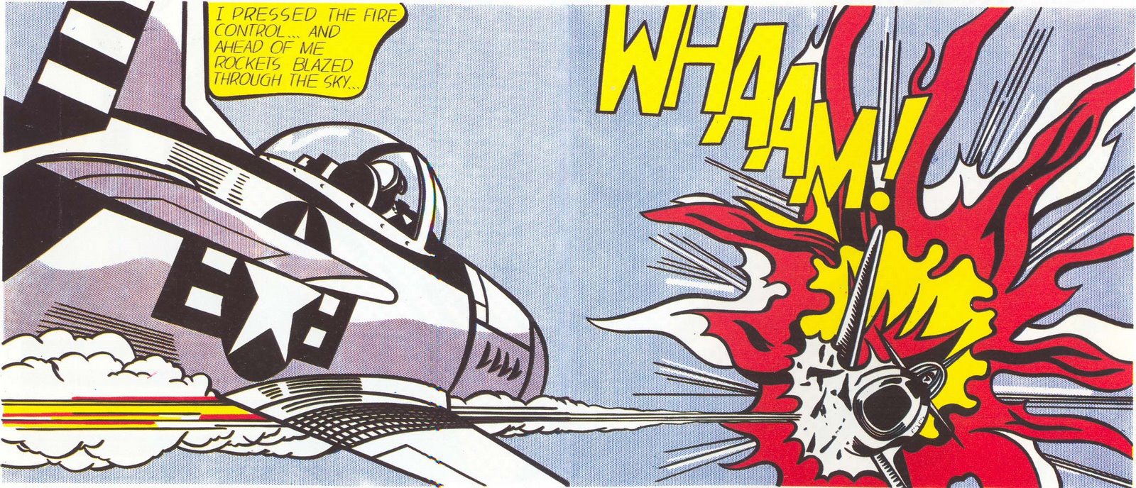
Point out and discuss: Onomatopoeias are words that read like they sound. Writers use them to create a sound effect and make their writing more expressive and engaging. The onomatopoeia “wham” is an integral part of this painting. How does this onomatopoeia inform this painting and support Lichtenstein’s intentions?
Turn, Talk, and Report Back (Possible answers: You know Whaam! is important because it is a major design element and the title of the painting. Whaam creates a “sound” effect for the visual impact of the painting, so you experience the painting with multiple senses. By coloring the dramatically staggered letters in yellow, Lichtenstein creates a crucial unifying design element that leads the viewer’s eye across the painting’s two panels from the center of the explosion, up to the speech bubble, and back around to the vapor trail of the missile, whose strong horizontal lines take the eye back to the explosion. By using the onomatopoeia in the title Lichtenstein is exploding more than just the airplane, he may be suggesting that this painting is exploding established conventions.)
Compare and Contrast the Source Comic
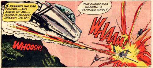
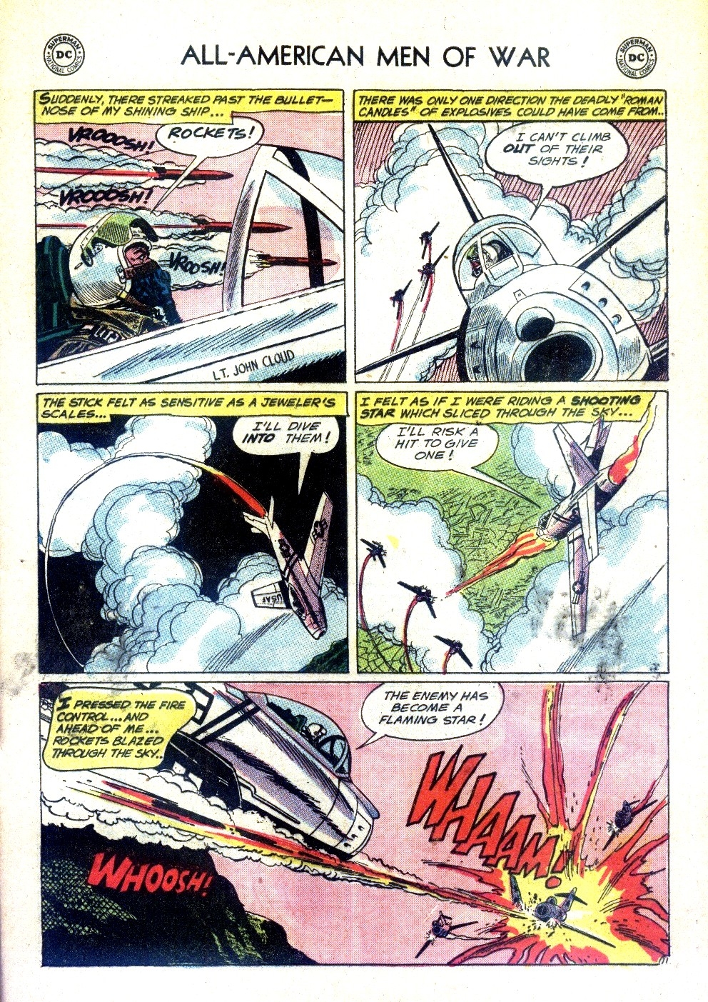
Point out and discuss: Critics of this and other similar paintings contend that they are just copies of the original comic strip. Lichtenstein and his supporters say that in order to achieve a unified and harmonious composition that can stand on its own as a work of art the source images are reworked, for example colors are brightened, extraneous details are eliminated, and positive and negative spaces are reframed. Compare Whaam! to the original source image drawn by Irv Novick for DC Comic’s All-American Men of War (No. 89, Feb. 1962). How is the painting different than the source comic image? Do you think these differences make Whaam! a unified composition that can stand on its own?
Turn, Talk, and Report Back (Possible answers: By removing the two fighter jets next to the explosion, the word whoosh, the speech bubble, and the dark mountain in the lower left corner, Lichtenstein simplified the composition. Changing Whaam! from red to yellow created a unifying yellow design element (see above). The background is changed from a pink hue to a blue gray that compliments and invigorates the remaining colors. The explosion is simplified and made more robust and vibrant. The plane on the left is lowered and made bigger which brings greater balance to the overall composition. The plane on the left is dramatically angled creating aggressive lines that heighten the sense of motion and make the image more compelling. To heighten the contrast and unity, the black and white is intensified throughout the composition. And of course there is the scale and heft of the image. The comic strip is small and easily discardable, while the two-panel painting is a substantial 13 feet wide by almost 6 feet high. Isolating and magnifying the image makes the form more abstract and stylized. Instead of being a large comic strip, Whaam! is a dynamic modern history painting.)
Compare and Contrast to Abstract Expressionism
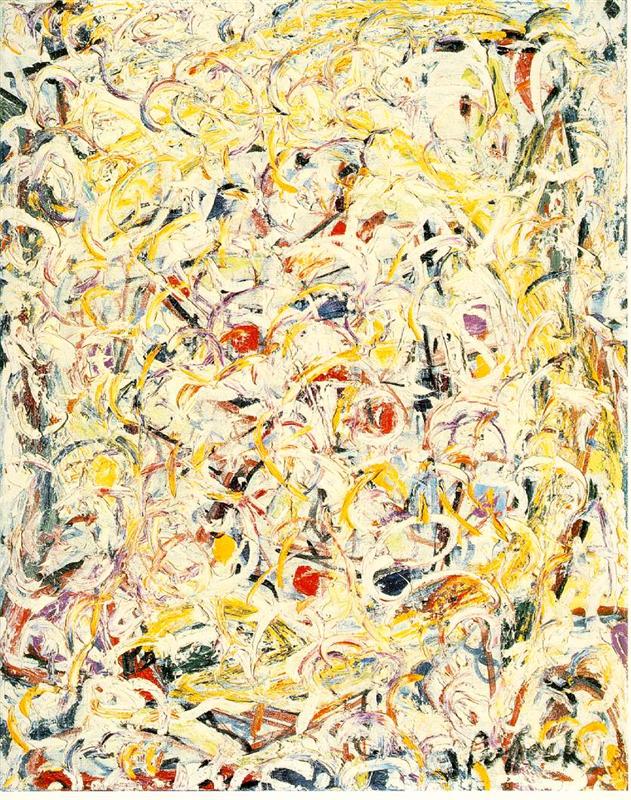
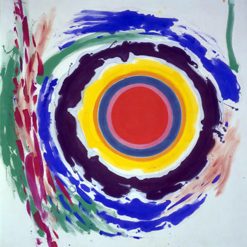
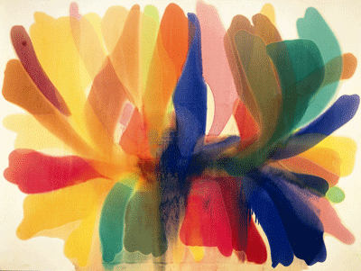
Point out and discuss: Lichtenstein’s Pop art paintings were dramatically different than the Abstract Expressionist paintings that dominated the established art world. Compare Whaam! to three Abstract Expressionist works painted just years before Whaam! was painted—Jackson Pollock’s Shimmering Substance (1946), Kenneth Noland’s Heat (1958), and Morris Louis’s Point of Tranquility (1960). How is Lichtenstein’s painting different than these Abstract Expressionist paintings and how is it similar? What might Lichtenstein be saying with the similarities?
Turn, Talk, and Report Back (Possible answers for how they are different: Abstract Expressionists emphasized the artist’s touch and gesture, while Lichtenstein negated the artist’s touch and made his Pop art paintings look mechanistic and mass produced. Instead of expressive brushstrokes, Lichtenstein used Ben-Day dots to simulate tone and shadow. Instead of free flowing lines and abstract imagery, Lichtenstein used heavy black lines to frame his stylized representational images. Instead of looking spontaneous and emotional, Lichtenstein’s paintings look reproduced and emotionally cool. While Abstract Expressionists looked internally for inspiration, the Pop artists looked outward at the world around them.
Possible answers for how the paintings are similar: Both the Pollock painting and Whaam! use an energetic yellow circle to unify their compositions. The Ben-Day dots create an undulating background like Pollock’s shimmering surface. If you take the word Whaam! off the right panel, it looks like an Abstract Expressionist painting. Both use big bold saturated colors to depict explosive energy. It’s as if the fighter jet is shooting a missile at an Expressionist painting. Lichtenstein is dropping a bomb on the established art world. Lichtenstein is having some fun with the viewer so it’s OK to laugh.
Think Like an Artist
Lichtenstein’s creative process followed a straightforward series of steps.
- Select and crop an image.
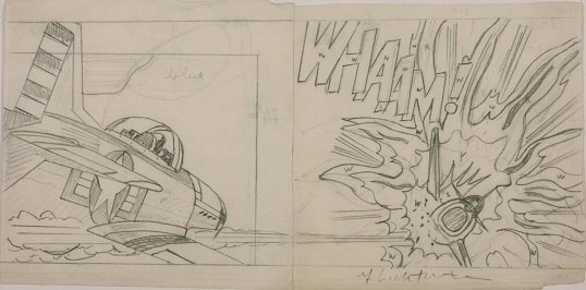
- Sketch and modify the image by hand.
- Use an opaque projector to magnify the image and retrace it.
- Paint the canvas on a rotating easel with Ben-Day dots and thick black lines.
While his critics may have accused him of simply copying a comic strip, each of these steps offers an opportunity for individual expression. To better understand these opportunities, try the first two steps and share them with your classmates. Note the range of different responses and how these “copies” express personal feelings and insights. Explore the power of scale by projecting the images and viewing them at human size.
Life Lesson
Be boring and harness the power of the routine. Because of his regular and orderly approach to art making, Lichtenstein referred to himself as boring. His friends and collaborators did not accept that label, opting instead for “professional,” “disciplined,” and “incredibly hardworking.” Even his obituary in The New York Times noted the rigid predictability of his routines when they described him as “A man of habit, he abided by strict hours, pausing for lunch precisely at 1 P.M.” Whether you call it boring or disciplined, regimented or steady, harness the power of the routine. Creative work requires long stretches of distraction-free time and routines build that time into your day. In addition, the regularity and comfort of the routine helps you ease back into creative rhythms. Lichtenstein would have agreed with Somerset Maugham when he said, “I write only when inspiration strikes. Fortunately it strikes every morning at nine o’clock sharp.” So don’t sit around waiting for inspiration, pick up that lunch box and get yourself to work again, and again, and again. Keep the streak alive and be in awe of where it takes you.
Related Video
- Whaam Roy Lichtenstein at the Tate Gallery (59:07) presented by Alastair Sooke is a superb overview of Lichtenstein’s work, process, and technique within the context of his Tate Gallery retrospective and his Whaam! painting. Introspective conversations explore the significance of the work. If you only have a few minutes for this lesson view from 35:00-40:00.
- Roy Lichtenstein: Diagram of an Artist (9:00) offers archival footage of Lichtenstein at home and at work in his studio.
- Roy Lichtenstein – Biographie des Pop Art-Kunstlers (29:11) offers a detailed chronological overview of his career and turning points. It includes engaging graphics that riff on Lichtenstein’s style.
- The Life and Art of Roy Lichtenstein (49:05) is a sophisticated documentary built on extensive artist interviews.
Integrating into Your Curriculum
Artists oftentimes use common visual strategies or signposts to alert viewers to significant details in their art. Here are some ideas for using these visual signposts to unpack a work of art. Remember, the close reading skills in art appreciation are similar to the close reading practices taught in reading.
Literature Links: What piece of literature would you partner with Whaam!? Whaam! could inform the study of literature from the same era that satirize contemporary society or find inspiration in common cultural events and experiences.
- Truman Capote’s In Cold Blood (1966) is a nonfiction novel that reframes a ripped-from-the-headline crime spree and conviction.
- Roald Dahl’s Charlie and the Chocolate Factory (1964) uses satire to explore human excess and mechanized food production.
- Ken Kesey’s One Flew Over the Cuckoo’s Nest (1962) explores the absence of logic and sanity in America’s institutional processes.
- Joseph Heller’s Catch-22 (1961) chronicles the absurd world of airmen during World War II.
- Tom Wolfe’s The Electric Kool-Aid Acid Test (1968) is a nonfiction novel that explores the hippie culture as it chronicles Ken Kesey’s travels across America.
Writing Opportunity: Argument Essay As the opening excerpts attest, Lichtenstein’s art polarized public opinion. Some called him a mindless copycat while others saw his art as innovative and sophisticated. Argument essays offer an ideal format for exploring these divergent opinions. Building on the learning in this lesson, have students argue the point from one side or the other. For additional support you may want to have students consider Wet Canvas’s online discussion Deconstructing Roy Lichtenstein. In addition to arguing their position, remind students that compelling argument essays recognize and refute opposing arguments. This online discussion provides a wealth of points, both thoughtful and misguided, to draw on.
How would you use this photograph to build on one of your units of study? Please share if you have other ideas on how to teach Whaam! by Roy Lichtenstein as an English/language arts lesson plan.

Comments are closed, but trackbacks and pingbacks are open.