
-
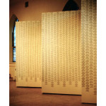
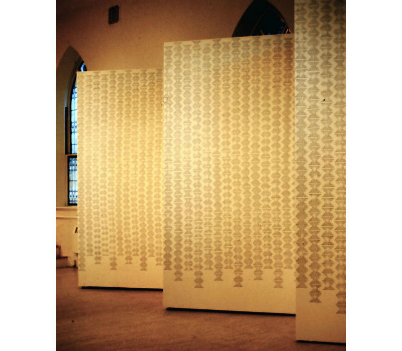
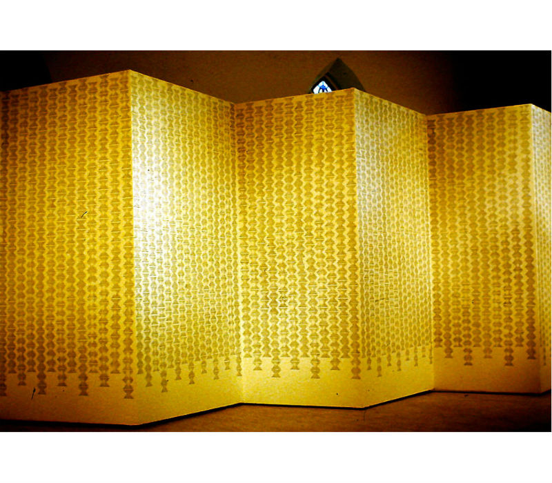
- Endless Column, rubber-stamp pattern
-
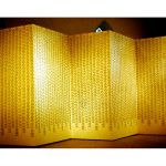
- Endless Column, rubber-stamp pattern
-
- Endless Column, rubber-stamp pattern
-
- Endless Column, rubber-stamp pattern
-
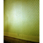
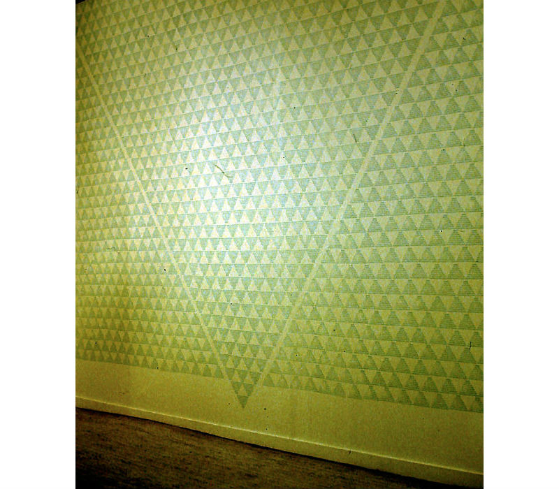
- Do Over, rubber stamp pattern
-
- Do Over – detail, rubber-stamp pattern
-
- Do Over – detail, rubber-stamp pattern
-
- Endless Column, rubber-stamp pattern
-
- Endless Column – detail, rubber-stamp pattern
Like the stones discarded by the glaciers, I find shapes and patterns in the cast-off arguments and dispassionate sound bites of our leaders. The rubber stamp series uses the anonymous institutional authority of a rubber stamp to create screens of the mindless, unchallenged statements that have become the fabric of political discourse and corporate spin. Blindingly repetitious and delivered with a punch, the rubber stamps create camouflage patterns that obscure and conceal. While they can be seen, they fade unread into the environment.
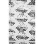
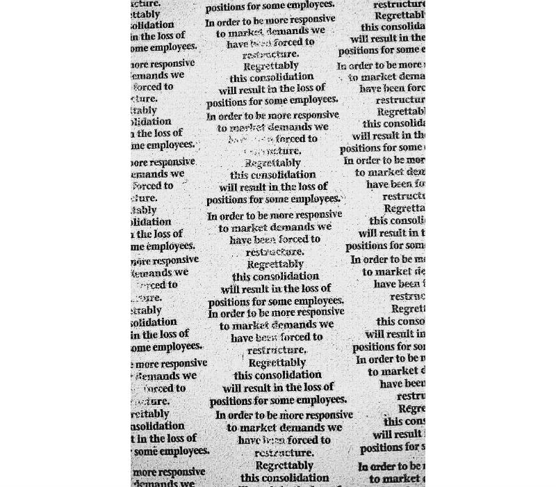
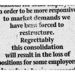
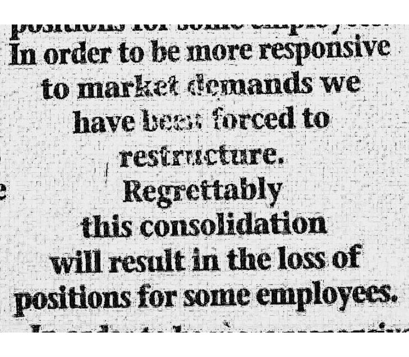
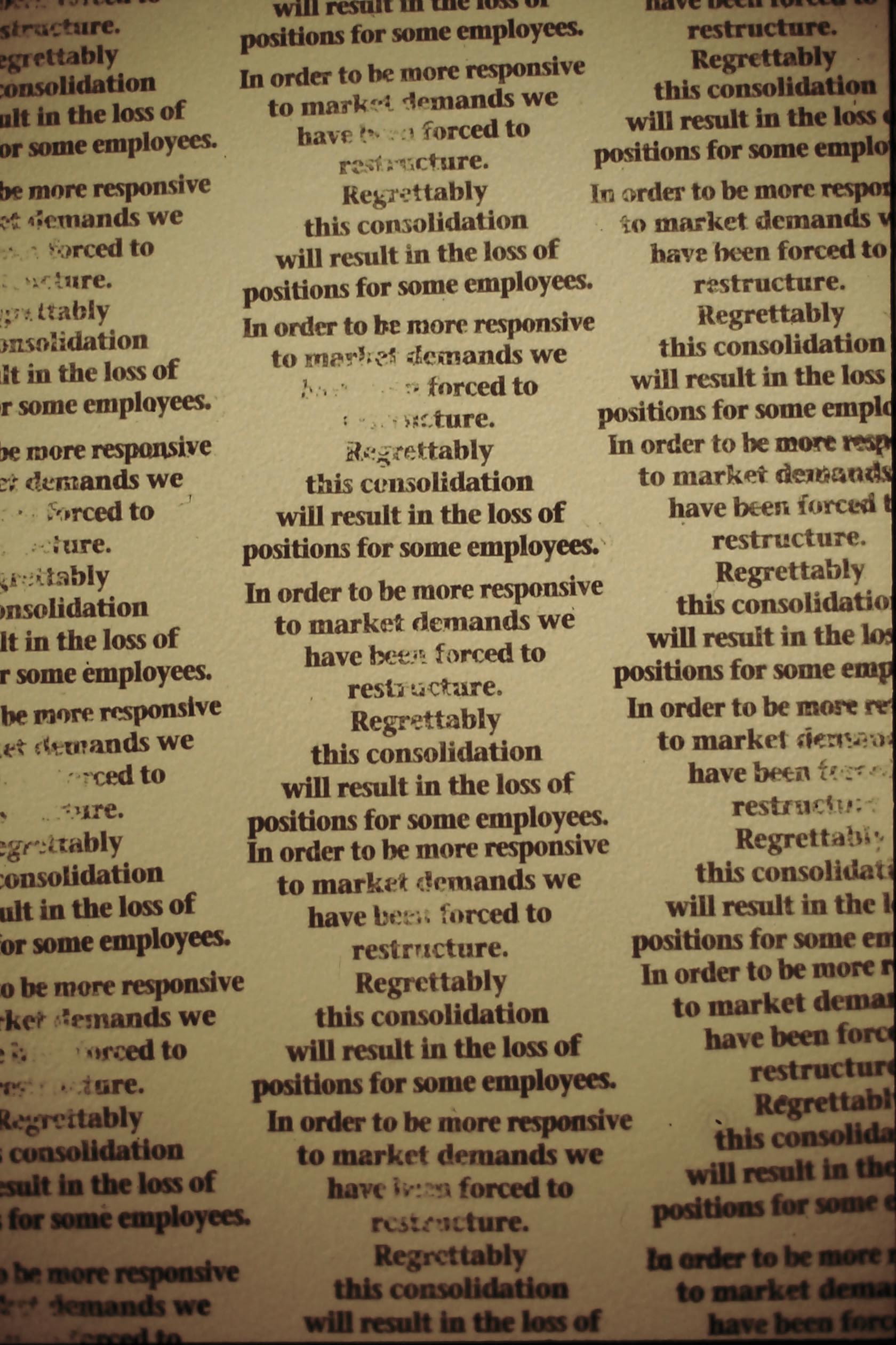
- Endless Column rubber stamp statement: In order to be more responsive to market demands we have been forced to restructure. Regrettably this consolidation will result in the loss of positions for some employees.
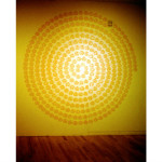
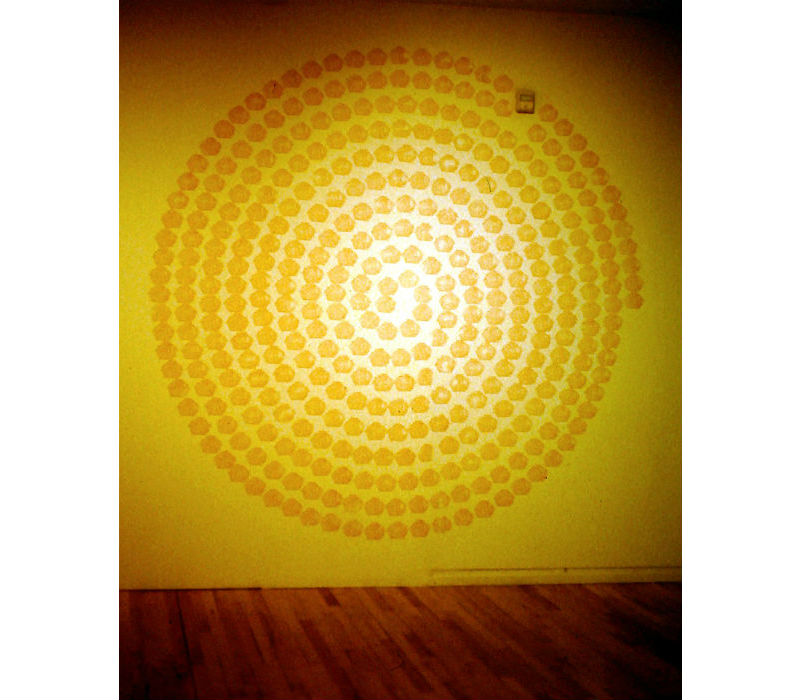
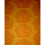
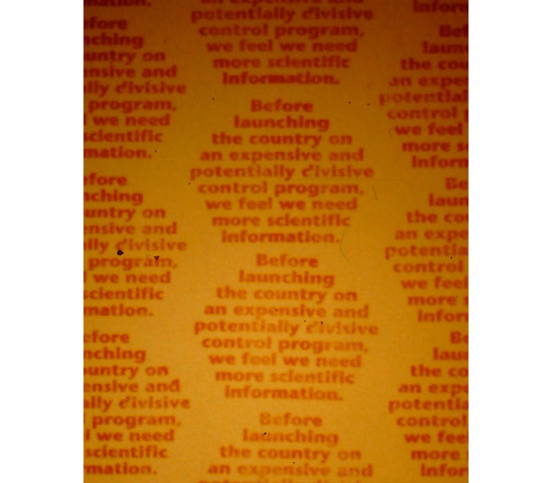
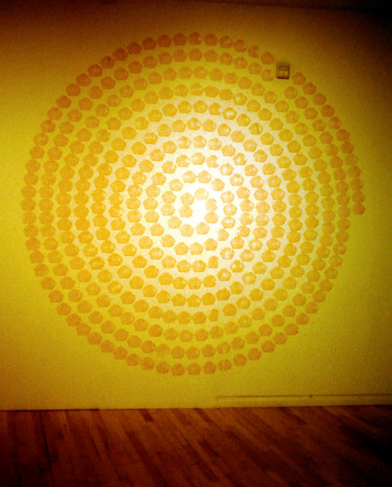
- Nero’s Refrain rubber stamp statement: Before launching the country on an expensive and potentially divisive control program, we feel we need more scientific information.
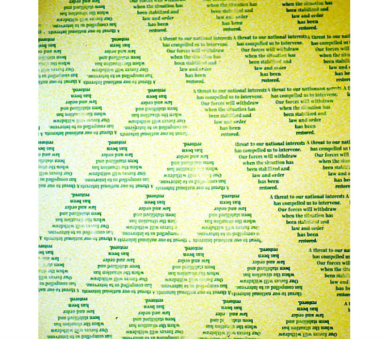
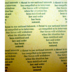
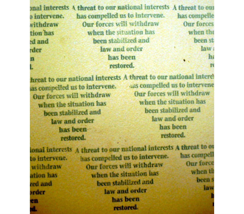
- Do Over rubber stamp statement: A threat to our national interests has compelled us to intervene. Our forces will withdraw when the situation has been stabilized and law and order has been restored.
“Nero’s Refrain”
The rubber stamp series resonates with me differently than my other work. Every time I see a picture or artifact from the installation I get agitated. I think it is because those insipid quotes have really gotten under my skin.
Nero’s Refrain was the first rubber stamp I made. That quote comes from the Reagan administration and was used to explain why the nation couldn’t implement strategies to mitigate acid rain. Of course, this is the catch phrase for the anti-environmental movement. Leveraging the metaphorical statement “Nero fiddled while Rome burned,” this sad song is repeated every time we want to avoid dealing with climate change or species displacement or the evils of factory farming or…. It is an argument that endlessly spirals in on itself until all reason is lost. One of the biggest challenges in creating this piece was getting that spiral right. I won’t go into the details here, I am just glad it worked. I did like the way the lighting in the show made the center of the spiral fade in on itself. Unlike the other rubber stamp patterns, I did not manipulate the font to get a clear shape. I loosely based the shape and the color off a stop sign, though I like that in repetition it conjures other imagery.
“Endless Column” (detail)
The Endless Column quote is drawn from a company-wide memo on why lay-offs were occurring in our office. It is used every time a company has massive layoffs. It’s not personal and it’s not the manager’s fault, we are, after all, just puppets in the marketplace. So it must be just a coincidence these layoffs occurred just after a disastrous reading textbook adoption where high-ranking (and still employed) managers made some really bad strategic decisions? I guess it does sound better than saying “Your fired because I stupidly invested in flawed technology or junk bonds or lavish bonuses for a few.”
The repeating modules of the rubber stamp pattern draw on Brancusi’s Endless Column. What he described as “a column for infinity.” In its most celebrated form Brancusi’s sculpture symbolizes the “Infinite Sacrifice” of the Romanian soldiers in World War I. For me, this imagery evokes the seemingly endless lines at soup kitchens, unemployment offices, or any place the sacrificed are relegated for survival. The black ink on a white wall seemed fittingly stark, impersonal, and corporate.
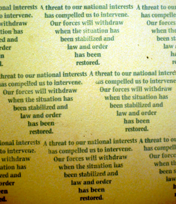
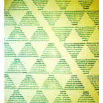
“Do Over” (detail)
The Do Over quote is a common quote every time we invade a country to “protect our national interests.” I picked up this quote from a news story on the invasion of Grenada but I remember it equally distinctly when we were rooting out weapons of mass destruction in Iraq. The shape of the pattern was loosely based on the triangular shape of the Stealth Bomber. In this light, the camouflage-green pattern on the wall looks like formations of aircraft on a collision course. I also liked the way the negative space in the pattern conjured the three triangle pattern used to mark radioactive waste. The Do Over title draws on a common phrase when young boys are at play, and is an equally apt sentiment when playing video war games such as Call of Duty. Except, in both of those instances people aren’t really dying.
“The New Art Center in Newton has a word show, ‘The Touch of Language’…The engrossing exhibition focuses on the physicality of words, whether it’s the raised characters of Braille or the mindless, mechanized authority of rubber stamps or intensely personal, hand-formed out of plaster.…
McQuillen’s medium is the rubber stamp, creator of impersonal, bureaucratic commands. He stamps the same phrases over and over obsessively, covering entire walls. One huge wall folded like a screen is covered with the robotic message ‘In order to be more responsive to market demands we have been forced to restructure. Regrettably this consolidation will result in the loss of positions for some employees.’ The words are arranged in vertical zig-zags that echo the grand horizontal accordion effect of the wall itself. Each clump of words is partly blotted out, and at the end of the wall, the clumps fade and fizzle, as if the whiteness of the wall had conquered them, as if they were exhausted.…”
— Temin, Christine. “Word Show Is a Real Wall Turner,”
The Boston Globe. Boston, MA. November 1, 1994.
- Do a close reading of each statement? Do these statements seem reasonable to you? Do these statements rely on emotion or evidence? Do these statements reflect personal choices or are they driven by outside forces? Where have you heard these statements used?
- How do the titles inform the pieces?
- How do the repeating patterns reinforce and extend the interpretation of each statement?
The popularity of text-based art has grown dramatically. Students may be inclined to try their own text-based works. See The Bluebird, the Recipe/Storm Drain Stenciling Project , and Trespass for other text-based installations. Comparing and contrasting these pieces may help students think through how they want to render their own work.
A Google search of text-based art highlights the depth and diversity of this art form. Here are a few artists you may want to consider Barbara Kruger, Leon Reid IV (students may especially like his College Degree Toilet Paper), Lawrence Weiner, Bruce Nauman, Jenny Holzer, and Patrick Martinez.
Note, some text-based art can be especially provocative and controversial so review carefully before sharing.