Weighing a pig doesn’t make it fatter. Using tests to improve education can be equally absurd.
While we have never been better at slicing and dicing student performance, test findings analyzed on a bell curve still make half the students winners and half the students losers.
Don’t get me wrong, I am not anti-testing. I actually believe we should teach to the test—if that test is worthy of our students and society’s educational aspirations. When tests inform instruction and help students achieve content and skills mastery, they can be powerful educational tools. Too often however, high-stakes tests have a bigger impact on our property values than on our children’s learning. They certainly don’t map a path to mastery or cultivate a love of learning. This of course is bigger than the test. Long after the content of the test is forgotten, the lessons of the test take root—and are reinforced year after year. For one to win another must lose.
Such complicated and conflicting feelings. Since this is a fundamental concern shaping education today it is a topic worthy of greater reflection. I decided to do this through a sculpture, and in keeping with art school practices, I thought I would welcome you to critique and shape this sculpture. Please include thoughts you want to share in the space provided below.
The imagery that guides me
- Seesaws may be one of the most traditional and enduring of playground artifacts. With a trusted friend on the other end, they can offer an joyful, even liberating, experience. However, with a less trusted counter balance, they can epitomize Lord Acton’s quote “Power tends to corrupt and absolute power corrupts absolutely.” How often have you seen a seesaw used to taunt the one who is suspended. There is inherent risk and inequality in seesawing.
- Balanced scales are an ancient tool for measuring weight and establishing value. The justice system adopted them to symbolize fairness and truth. Balanced scales can also be easily cheated and rigged to balance in a favored direction. The balance is both telling and tenuous.
Click on the images to enlarge.
The elements
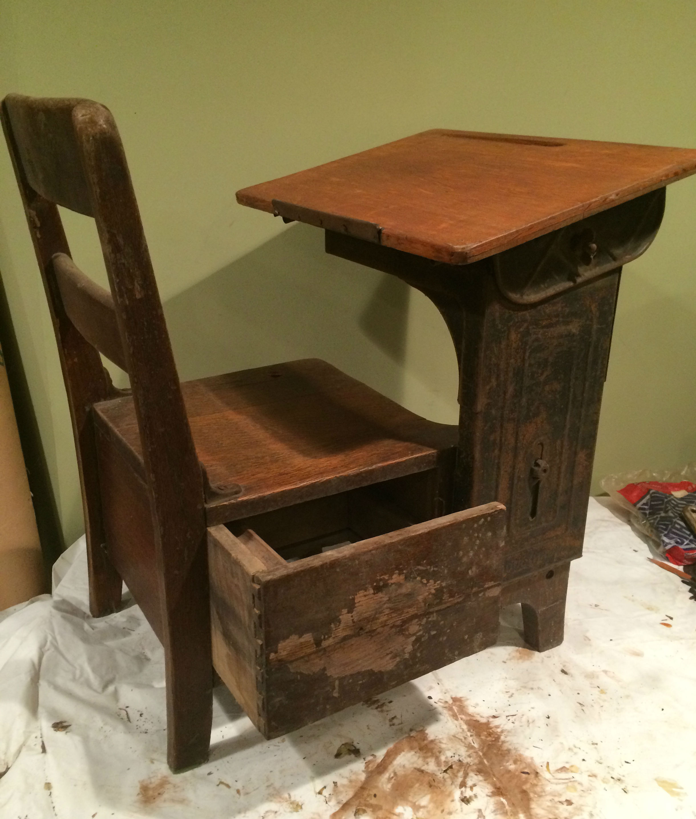 The desks (Moulthrop) are salvages from a former school house in Vermont and date back to the early 1900s. These instantly recognizable artifacts drive the scale, makeup, and aesthetics of the other elements.
The fulcrum or pivot needed to be stable enough to safely support and visually compliment the two suspended desks. At the same time I didn’t want this functional element to visually overpower the desks.
 The lever that connects the two desks represented the biggest technical challenge. I wanted to keep the heft of the original desk tops but also needed something strong enough to securely suspend the two desks. Originally I used 3/4 inch plywood with an inner armature of 1/2 inch square steel tubing. While the inner armature minimized the play in the lever, there was enough to be a little distracting. (see picture) An inch marine plywood seems a better visual and structural solution.
The balls on top of the fulcrum could be seen as decorative elements but I was looking to create all-seeing eyes. The high gloss/matte finish has a really nice effect. (My wife says they look like pupils, “get it pupils can be a part of an eye or a student, and this is about testing.” Yes, she is a laugh riot.)
As an installation artist I am inspired by place. That can be a geographic location, a moment in time, or an intersection of ideas. This piece grew from multiple convergences. While I had kicked the idea of this piece around, an invitation to join the exhibit Ode to Joyce McDaniel: Sculptor and Teacher provided the necessary context to bring it into focus. To celebrate Joyce’s long career as a sculptor and Museum School instructor, the show exhibited Joyce’s sculptures and the sculptures of nine of her students.
In 1993 I had served as Joyce’s teaching assistant in her Materials a Week course. Each week we practiced reseeing everyday materials, exploring the expressive potential in their inherent qualities. We learned that responding to and building on these qualities could be transformative. For example, instead of simply being a sooty residue, smoke could uniquely evoke the ethereal and the sacred. Under the right conditions mundane toilet paper could create elegant, whimsical, and thought provoking works of art. In seeing the everyday with fresh eyes the artist is likewise transformed. See the Medium a Month showcases for examples of this process.
Joyce’s classes stood in opposition to the bell curve. Long before I learned about the reading and writing workshop approach to teaching, Joyce modeled the benefits of a collaborative workshop learning environment. As we huddled around a work, thoughtful class critiques accompanied by slide presentations challenged and elevated all students equally. In that setting each student’s interests and inherent qualities were drawn out and, as Joyce contends, student and teacher alike were transformed.
Abbie, I gave your wheel idea a try. I looked at a lot of options and these seemed to match the hardware on the desks. What do you think? I like the way they make the piece more “functional” and the balance more suspect. Plus, it will make moving it around a gallery easier.
For another installation that uses classroom artifacts see The Bluebird

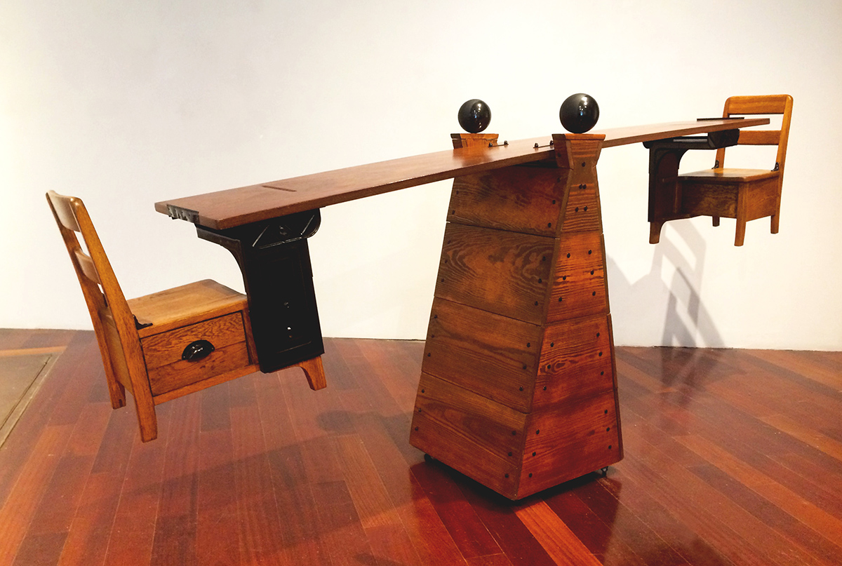
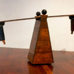
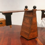
Love the wheels! Aesthetically they are the perfect balance to the pupils. They are small, discreet and yet mighty enough to carry the whole concept/sculpture. Now the next iteration might have bent rails for the whole structure to see-saw back and forth to further reinforce precariousness of our ed institution. Enough! I digress. Maybe spilled milk at base is enough. Banana peel? Nicely done, Charles, this piece is really beautiful.
I am no educated art critic but I know what I like and what speaks to me. This piece has attractive materials and a thoughtful design which I like and it lets you know right up front that it is saying something. I like that it is whimsical and reflects a sense of humor. The warmth of the material and the importance of the subject matter is all to the good. To me it is also about the entitlement of some (high end suburban schools and high cost private schools) in many ways coming at the expense of others (inner city and poor rural communities) caused in part by how schools are funded and subsidized etc. In addition to me it is about the constant up and down in education: -yes common core is great we need to catch up to the rest of the world, no my kids aren’t doing well so common core is a travesty; we need a common set of standards and rigorous testing, no testing does not help kids learn; new math/old math, teach kids English right away/no teach them in their native language; middle school/Jr. high etc.
At first I thought it had a helicopter feature which would be appropriate for this day and age. Overall very cool and a great conversation starter.
Like you, I am drawn in by an artwork’s materials and general design. You can never underestimate how visual allure can engage a viewer. I also appreciate your expansive view of education’s constantly shifting terrain. Like a pendulum, education’s fads and trends rise in popularity only to later fall out of favor.
I really love this piece. I love its solidity, warmth of color and the very evident balance of our precarious ed system on a pyramid base which reinforces the elitist rise to the top. I like the black spheres as they suggest a counterweight, softening of sharp edges, and judicious presence (and yes! ever-watchful ‘pupils’ too!) Most memorable for me is its simple and solid presence. The representation of school whether balanced or not is here to stay. If the whole sculpture was painted white with a metal base it would be sterile and institutional, whereas yours has an old-time warmth that feels hopeful and familiar.
When you made reference to showing in your studio vs outdoors it got me thinking about mobility and wondered if the structure could be mounted on wheels or something to suggest how in flux our ed system is; (black caster nice balance to your ‘pupils’). New admin: new focus; always a moving target with our kids the pawns. Weren’t we following the Finish and then Japanese models for a while?? Now Common Core with big profits going to the testing agencies?
Overall very thought-provoking piece. Thank you for pushing me to think differently.
Thanks for the kind words. The idea of wheels is intriguing. It would make the instrument seem more functional and universal, at the same time less grounded and more suspect. This consideration needs to be balanced against the aesthetics of the desks. No matter where I land, the implications are fun to think about.
How engaging this sculpture is! My strongest thought–suitably–is how awkward and it would be for a child to get into those seats or use this structure safely or for any comfortable purpose at all. I can almost feel the bruised shins and banged up elbows that would come of even trying. And I recognize how the children’s fit in this sculpture was NOT my first thought, just as children’s fit isn’t what the field tends to think first about testing.
As I worked on the desks I did think one person’s sturdy/reliable/functional is another person’s unforgiving/forced uniformity. I like your evolving thoughts on the student. The apparatus itself frames the argument. Rather than challenge the propriety of the instrument, we focus on how to best tip the scales. Just measure them and move them on.
How about putting something on one of the chairs to tip the balance, representing school learning plus something else? Sneakers? A can of paint brushes? A fishing pole?
I like the way the balance has you thinking and visualizing. That may have more value than anything I can add.
There are so many things to like about this piece – from the concept to the craftsmanship to the overall impact. The simple design of the seesaw with its basic but beautifully rendered structural elements, really allow the simplicity and weight of the desks feature prominently. Your work is always thoughtful and well executed, and Bell Curve is another outstanding example of your vision and skills.
Thanks for the kind words, aka marketing copy. Yeah. I like the simplicity too. I have to be careful not to junk this up. But then again, little details can be compelling. Like groping in the darkness, I have to feel my way.
Nice, but I think you are under-utilizing the desk drawers, which makes the piece too sterile. At one time these drawers contained all aspects of a student’s life at school. These could be left partially open with hints at any number of dichotomies peaking up above the opening – Vermont’s current Framework of Standards and Learning Opportunties in one drawer and a 19o0 Vermont Civics textbook in the other. Or, instead of putting them in the drawers, any number of artifacts could be left by the piece with the viewer invited to place the items on the desk’s traditional writing surface and see how this affects the seesaw equilibrium. How does a modern ipad tablet on one desk and a slate writing tablet on the other affect the equilibrium.
I do love the desk drawers. They were one of the features that made me use these desks. I like the way they have you thinking about what goes in them. They have me thinking about the types of things that balance, or imbalance, education. A dictionary, money, or technology are certainly loaded symbols. Keeping the drawers closed may prompt deeper reflection on this precarious balance.
Nice work, Dr. M! I’m drawn to the piece and grasp the see-saw analogy right away. What I’m not getting is the testing angle, and maybe this can be brought out somehow on the top of the lever? Questions and bubble answers? And/or on the base? Allowing the piece to revolve horizontally would also get at the idea of the never-ending testing (if the testing angle is made more obvious). Thanks for sharing. Love to see you at work like this.
Thanks for your kind words and thoughts. This piece is still evolving so it will be interesting to see where it goes. While testing was an initial impetus, the juxtaposition of school desks and balanced scales now has me thinking about education on a broader level. I am also cautious about getting too didactic. Ambiguity and viewer interpretation dance in the space between art and propaganda. You are right, the movement of the lever does make this piece much more dynamic, something a static photo doesn’t show.